Understandable (Identity Refresh)
I developed a speculative brand refresh for Cascade Orinteering in order to show the applcation of sound graphic design principles and how these might apply to various mediums including web and printed materials. I was the sole designer for this identity refresh.
Problem Statement
I sought to create a distinctive visual identity for the org, starting with a logo refresh, and using this as a foundation to create a brand design system that would include use guidelines and examples for various mediums.
The overall goal of the new identity would be to create greater visual cohesion among all the public facing deliverables of the org, and to create an inviting identity that would appeal to potential new members of the org.
Research & Analysis
I reviewed the organization's website as well as print materials available digitally on the website like handbooks, sign-up forms, and event instructions.
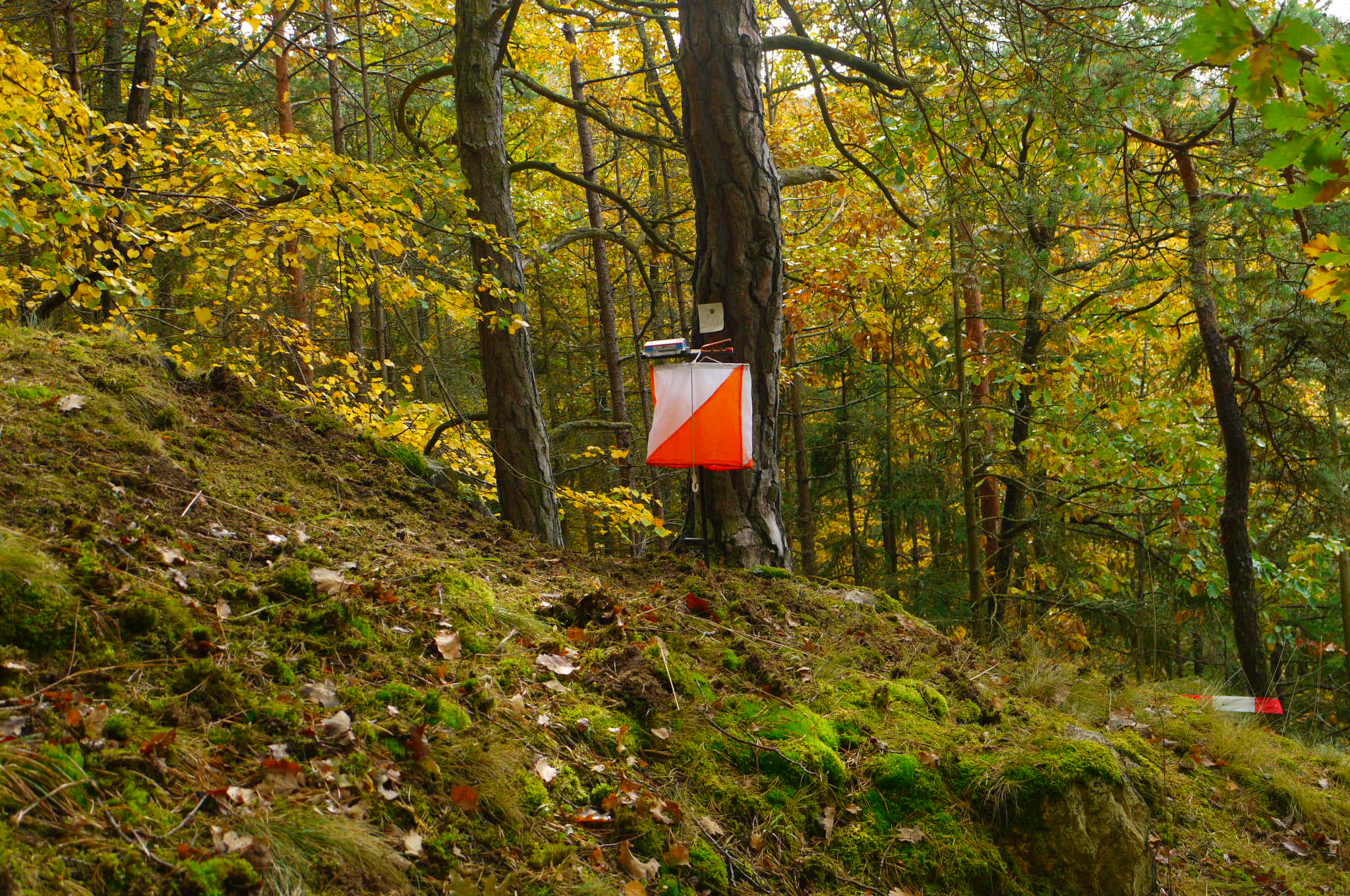
I was looking both at the existing visual identity of the org, as well as information on the history of the org and information about the orienteering sport, which I was unfamiliar with. I learned that orienteering is a competitive activity that takes place outdoors with both a technical and physical aspect, and would probably attract people who are into other outdoor or sporting activities like geocaching, hiking, and marathons. I learned about the symbology of the orienteering flag, which is an important part of the sport, and could see how that influenced some of the org's identity.
If time had allowed, I also would have attended an event. Unfortunately, events were on hold due to the Covid-19 pandemic during the time frame that I carried this activity out.
Ideation & Concept Development
With some base understanding of the organization and the sport, I began creating an identity. Because the course was in a studio format, I received peer feedback at every step along the way.
Presented in chronological order of how the concept and identity evolved.
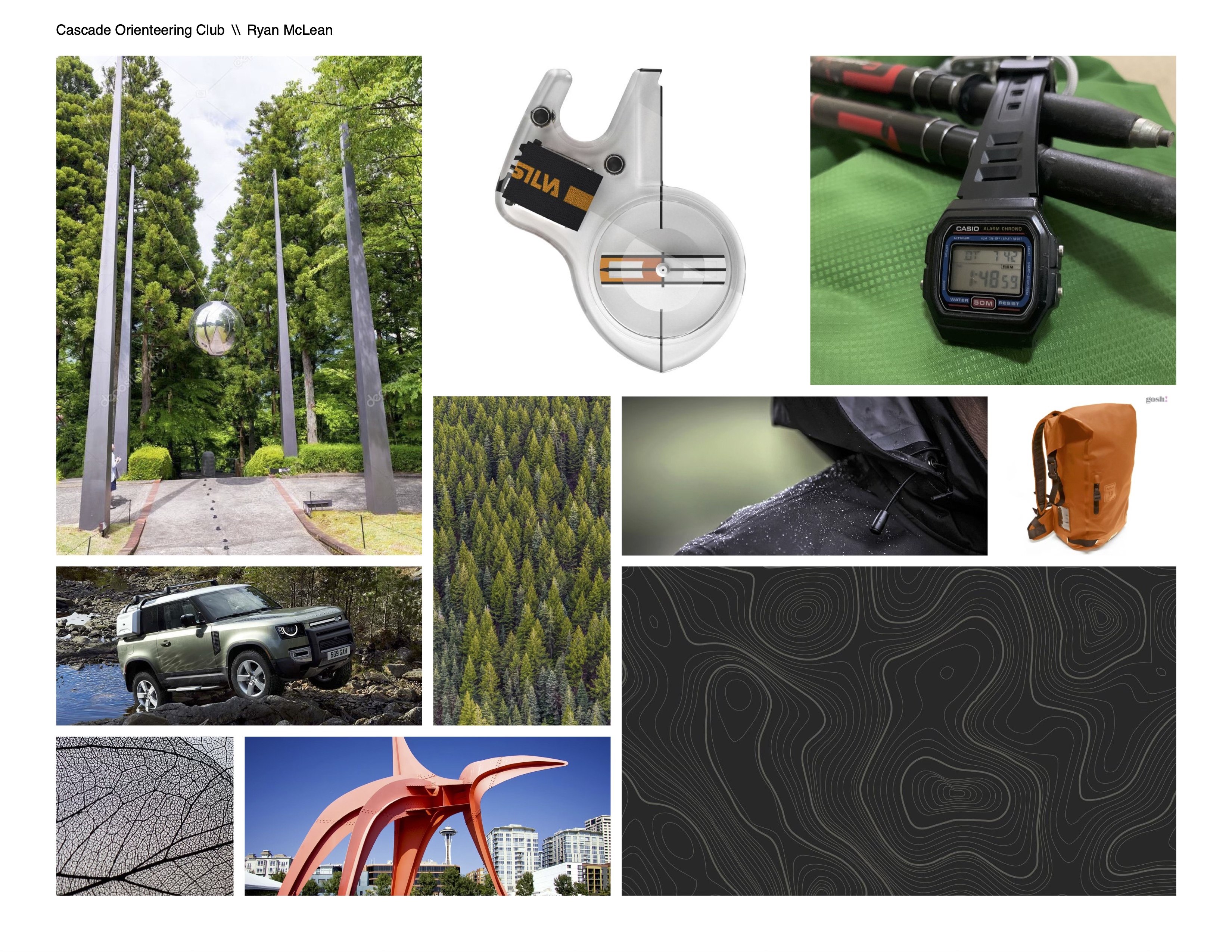
Mood Boards
I explored two divergent thematic directions to take the new identity in. One a traditonal outdoor feel with natural materials and soft, organic textures. The other was a modern take, featuring technoloical materials and sharp, hard textures.
Ultimately I decided to go with the more modern feel. The theme that I hoted to convery with this was performance.

Grid System & Layouts
From here I started developing a layout system through simple wireframes that reflected some of the concepts form the mood board. For the layout system, I drew inspirartion from the layout of maps -- which are sparse around the perimeter and dense toward the center.
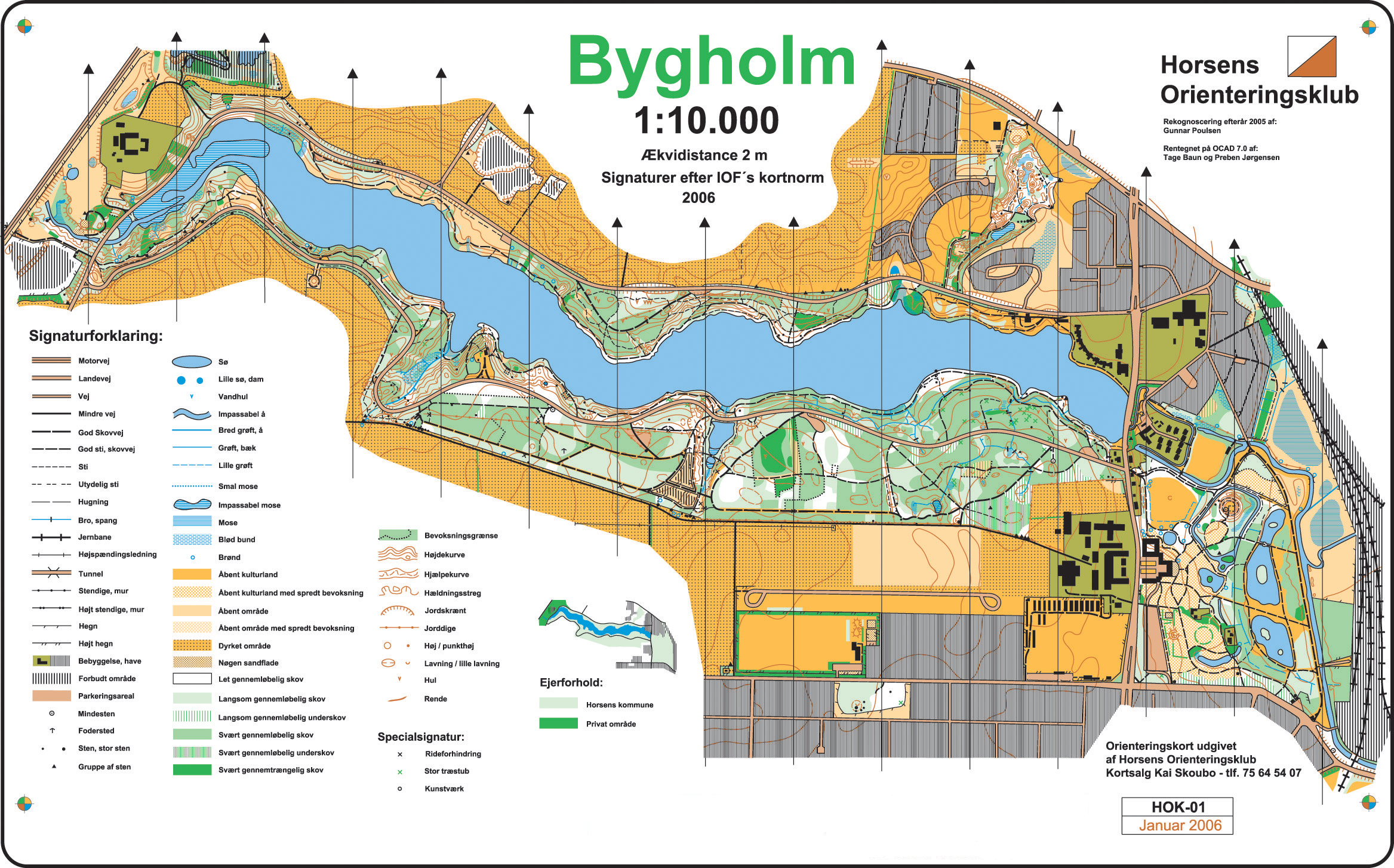
Tage Baun and Preben Jørgensen, CC BY-SA 3.0, via Wikimedia Commons
Logo
I explored several logo concepts, eventually settling on a logo that was an evolution of an older logo from the group. Conceptually I liked the logo a lot and tried to bring some of the elements it was suggesting out more boldly.
Typography & Color
For color, I again looked to the orienteering sport and orienteering maps for inspiration. This was a fun opportunity to use a bold color, international orange, as the prime color in a color system. The other colors were carefully selected for how they related to international orange, while at the same time reflecting colors one would see on an orienteering map.
Orange
Grey
Moss
Mauve
White
Implementation & Results
The visual concepts I defined and refined were compiled into an identity guide that defined the visual guidelines I created and explained some of the thinking behind these decisions. By providing not just the guidelines, but some of the underlying strategy, the identity could evolve further in the future in a way that would still be true to the intent of the strategy I created.
A full identity guide is available upon request.
Lessons Learned & Conclusion
Although I had carried out a fair number of small graphic design projects prior to this course, this was my most comprehensive "end to end" identity project. I enjoyed having the opportunity to exercise my artistic creativity in a technical way. I also gained a greater appreciation of design systems, and how these work as a common visual language to deploy across a variety of mediums and contexts.
